The Psychology of SaaS Onboarding: Why 75% of Users Never Come Back

75% of SaaS users abandon a product within the first week. Nearly two-thirds never reach the moment where the product actually delivers value. Most teams respond to numbers like this by redesigning screens: new copy, new illustrations, a shinier progress bar.
That’s usually the wrong fix. Onboarding drop-off is rarely a design problem. It’s a psychology problem. Users aren’t leaving because a button is the wrong colour; they’re leaving because the flow fights how the human brain actually processes decisions, effort, and reward. Below are 10 psychological principles that quietly break SaaS onboarding, with real examples of what they look like in practice and what to do instead.
1. Choice Paralysis
The problem: When users are given too many options before they understand the product, they don’t pick the “best” one – they freeze and pick nothing.
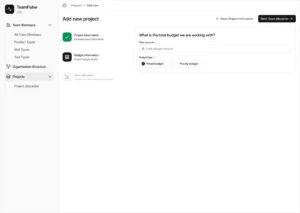
What it looks like: A sign-up flow that asks new users to choose between five pricing tiers, three integration options, and a workspace template, all before they’ve seen a single feature in action.
The fix: Default users into the single best-fit path based on their signup context (role, company size, use case), and hide the rest of the options behind a “customise later” link. Let people say yes to one thing before you ask them to compare five.
2. Cognitive Load
The problem: Every extra field, toggle, or decision on screen draws down a limited pool of attention – a pool that’s especially thin during someone’s very first session with your product.
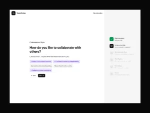
What it looks like: An onboarding screen with a form, a tooltip, a video thumbnail, and a chat widget all competing for attention at once.
The fix: One primary action per screen. If a screen has more than one thing a user could plausibly click next, it has too many things.
3. Anchoring
The problem: The first number or option a user sees becomes the reference point for every decision that follows – even if it’s arbitrary.
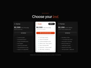
What it looks like: Pricing pages that lead with the cheapest plan, which then makes every subsequent, more valuable plan feel “expensive” by comparison, even if it’s the plan that fits the user best.
The fix: Lead with your best-fit plan, not your cheapest one. If you want users to anchor on value, show them value first.
4. The Zeigarnik Effect
The problem: Unfinished tasks stay active in working memory and create a low-grade tension until they’re closed; finished tasks get forgotten almost immediately.
What it looks like: Users start setting up a workspace, get distracted, and never come back, because nothing reminded them the task was still open.
The fix: A visible, persistent progress indicator (a checklist, a percentage bar) turns “I’ll finish this later” into “I’m 80% done, might as well finish now.” Incomplete-but-visible beats complete-but-invisible.
5. The Peak-End Rule
The problem: People judge an entire experience based on its most intense moment and how it ended, not on the average of every step along the way.
What it looks like: An onboarding flow that’s smooth for four screens and then ends on a bare form field or a generic “You’re all set!” message with nothing to actually do.
The fix: Design the last screen of onboarding as a small, concrete win, a finished first project, a working integration, a visible result, not an administrative afterthought.
6. Loss Aversion
The problem: Losing something feels roughly twice as painful as gaining the equivalent feels good. This shapes how people respond to upgrade prompts and feature gates.
What it looks like: A product that only ever advertises premium features (“Upgrade to unlock X”) instead of letting users experience them and then lose them.
The fix: Let trial users experience premium features directly, then frame the upgrade decision as “keep what you already have” rather than “buy something new.” Losing access reads very differently from never having had it.
7. Social Proof
The problem: When people are uncertain what to do next, they look to what other people like them are doing, far more than they respond to instructions telling them what to do.
What it looks like: A settings page labelled “Recommended,” with no further context, sitting next to features with no usage signal at all.
The fix: “12,000 teams have this enabled” consistently outperforms “Recommended” – specificity and social evidence do more work than a label ever will.
8. The F-Shaped Reading Pattern
The problem: Users don’t read onboarding screens top to bottom; eye-tracking research consistently shows people scan in an F-shaped pattern, giving far more attention to the top-left of a screen than anywhere else.
What it looks like: A key value proposition or CTA placed in the middle or bottom-right of a screen, where the F-pattern means most users never actually see it.
The fix: Put your single most important message and action in the top-left quadrant. Everything below the first two lines needs to earn a second look — most users won’t give it one for free.
9. Desirable Friction
The problem: Not all friction is bad. Removing every obstacle from a flow can backfire when the action itself carries real risk or weight.
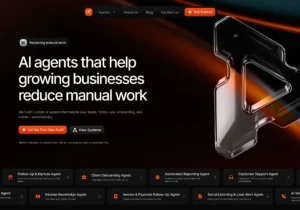
What it looks like: A one-click “delete workspace” or “cancel subscription” button with no confirmation step, designed purely to reduce friction — right up until someone clicks it by accident.
The fix: Add friction deliberately for high-stakes or irreversible actions. A confirmation step here isn’t bad UX — it’s the appropriate amount of resistance for the weight of the decision.
10. Expectation Misalignment
The problem: Marketing and onboarding are usually built by different teams, working from different messaging, and the gap between what was promised and what’s delivered is one of the most common (and most avoidable) reasons users churn early.
What it looks like: A user signs up because marketing copy promised “effortless project management,” then lands in onboarding that’s entirely about configuring integrations and permissions before anything resembling “effortless” shows up.
The fix: Audit your onboarding against your own marketing copy. The first thing a new user experiences in-product should be the thing you promised them on the landing page — not a prerequisite for it.
The Pattern Behind All Ten
Every principle above points to the same underlying truth: users don’t evaluate your product rationally, feature by feature. They evaluate it based on how much mental effort it demanded, how it made them feel at the end, and how closely it matched what they expected walking in.
That means the highest-leverage onboarding fixes are rarely about adding more – more explanation, more features, more polish. They’re almost always about removing: fewer choices, fewer fields, fewer screens between sign-up and the first real moment of value.
Where to Start
If you’re auditing your own onboarding, don’t try to fix all ten at once. Pick the single narrowest problem you already suspect is costing you activation — a form that’s too long, a pricing page that leads with the wrong plan, an ending that fizzles instead of lands – and test one change against that one problem.
A single fix aligned with the right psychological principle usually moves the needle more than a full redesign ever does.
Want a second pair of eyes on your onboarding flow? Get in touch with Inity – we help SaaS teams find exactly where psychology and product design are working against each other, and fix it.
Frequently Asked Questions
Most SaaS users abandon onboarding because the flow creates too much cognitive load or too many decisions before they've experienced any real value. This isn't usually a visual design flaw — it's a mismatch between the flow and how the human brain processes effort and decision-making.

Ready to Build Your SaaS Product?
Free 30-minute strategy session to validate your idea, estimate timeline, and discuss budget
What to expect:
- 30-minute video call with our founder
- We'll discuss your idea, timeline, and budget
- You'll get a custom project roadmap (free)
- No obligation to work with us