SaaS Brand Guidelines: What to Include?

Introduction
Most SaaS brand guidelines are built backwards. Teams spend weeks perfecting logo clearspace rules and Pantone colour codes: and ship a 60-page PDF that nobody reads, that does not cover how the brand sounds in an error message, and that has no section on how the product UI relates to the marketing site. A year later, the sales deck looks nothing like the website, the product interface uses a slightly different shade of blue, and new hires have no idea what tone to use in customer emails.
Brand guidelines fail SaaS companies not because they are too short or too long, but because they document the wrong things. The logo rules matter. But for a SaaS product, the brand lives primarily inside the product itself: in the onboarding flow, the empty states, the error messages, the dashboard. If your guidelines do not govern those surfaces, they are governing the minority of where users actually experience your brand.
At Inity Agency, brand identity is part of every SaaS product engagement we run. This post explains exactly what SaaS brand guidelines should include, what order to build them in, and what most guides include that is either missing or misdirected.
Layer 1: Brand Strategy Foundation
Brand guidelines without a strategy foundation are decoration rules without a reason. Before any visual or verbal system is documented, the guidelines should articulate — briefly and specifically, the strategic decisions that everything else is derived from.
Positioning Statement
One to two sentences that define what the product does, who it does it for, and what makes it different. Not a tagline, not a mission statement — a precise positioning statement that anyone can use to make a brand decision.
“[Product] is the compliance management platform for care home operators who need to track regulatory deadlines without IT support. Unlike enterprise compliance tools, [Product] is built for the operational manager, not the compliance department.”
This statement is not public-facing copy. It is the internal anchor that makes every downstream brand decision consistent. When someone is choosing between two tagline options, two illustration styles, or two ways of writing an error message — the positioning statement is the tiebreaker.
Target Audience
A brief, specific description of the primary user, not a demographic profile, but a behavioural and contextual description. What is their role? What does their day look like? What language do they use to describe their work? What makes them trust or distrust software?
For SaaS products with multiple user types, document each user type briefly and note how the brand’s tone adjusts for each — the care home manager and the compliance officer experience the same product but need different communication styles.
Brand Personality
Three to five adjectives that describe how the brand should feel — and, critically, the adjacent adjectives it should not feel. The distinction matters more than the adjectives themselves.
| We are ✅ | We are not ❌ |
|---|---|
| Direct | Blunt |
| Confident | Arrogant |
| Warm | Casual |
| Expert | Academic |
| Clear | Simple |
This table is the foundation of voice and tone. Every copy decision – button label, marketing headline, error message – can be checked against it.
Layer 2: Logo System
The logo section is what most brand guidelines cover well. For SaaS, what it needs to cover specifically:
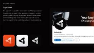
Primary logo and variations: The full logo, the logomark alone, and the wordmark alone, with clear guidance on when each is used. The logomark is used at small sizes and in contexts where the full logo would be illegible (favicons, app icons, social media profile images). The wordmark is used where the logomark’s context is already established.
Colour variations: The logo on light backgrounds, on dark backgrounds, on brand colour backgrounds, and in single-colour (black and white). SaaS products appear across contexts — dark mode interfaces, light marketing sites, dark social media posts, presentations, and the logo needs a documented version for each.
Clear space and minimum size: The minimum size at which the logo remains legible and the amount of clear space required around it. Express clear space as a proportion of the logo height, not as a fixed pixel value; it scales correctly across sizes.
Incorrect usage: Show what not to do. Stretching, recolouring, adding shadows, placing on conflicting backgrounds, rotating – document these explicitly. The section that shows wrong usage is more commonly used than the section that shows right usage.
Favicon and app icon: SaaS products appear in browser tabs, mobile home screens, and app stores. Document the favicon and app icon versions specifically, they are usually the logomark simplified to work at 16×16px and 1024×1024px, respectively, and they need their own documented specifications.
Layer 3: Colour System
The colour section for a SaaS product needs to go significantly further than a palette of five hex codes.
Primary Palette
The core brand colours: primary, secondary, and accent – with hex, RGB, and HSL values. For print materials, include Pantone and CMYK. For digital-first SaaS, hex and RGB are what matter.
Semantic Colour Roles
Document what each colour does, not just what it is. This is the layer most brand guides miss, and the layer that produces consistent colour usage across teams.
| Token name | Hex value | Usage |
|---|---|---|
color-primary |
#2563EB |
Primary CTAs, active navigation, key interactive elements |
color-primary-dark |
#1D4ED8 |
Hover state on primary elements |
color-secondary |
#F59E0B |
Secondary highlights, badges, tags |
color-success |
#10B981 |
Success states, confirmation, positive metrics |
color-warning |
#F59E0B |
Warning states, approaching limits |
color-error |
#EF4444 |
Error states, destructive actions, critical alerts |
color-neutral-900 |
#111827 |
Primary text |
color-neutral-500 |
#6B7280 |
Secondary text, placeholder text |
color-neutral-100 |
#F3F4F6 |
Page backgrounds, subtle surfaces |
Design Tokens
The most important colour documentation for a SaaS product is the token layer. Design tokens are named variables that store the colour values — when a colour changes, the token value updates and the change propagates everywhere the token is used.
This section documents how the brand colour tokens map to CSS custom properties or Figma variables, connecting the brand guidelines directly to the product codebase. Without this connection, brand updates require finding and changing every colour instance manually across the entire product.
Dark Mode Palette
If the product supports dark mode, which most SaaS products should, document the dark mode colour values for every semantic token. Dark mode is not an inversion of the light palette. It requires a separate set of deliberate colour decisions (see Inity’s guide to dark mode design for SaaS).
Accessibility Contrast
Document the contrast ratios for every text-on-background combination in the palette. WCAG 2.1 Level AA requires 4.5:1 for normal text and 3:1 for large text and UI components. This section is the compliance record that the accessibility statement references.
Layer 4: Typography System
Typeface Selection
Primary typeface (for headings and display use) and secondary typeface (for body copy and UI text). For most SaaS products, two typefaces are sufficient — a third adds complexity without benefit at this stage.
Document: typeface name, provider and licence (Google Fonts, Adobe Fonts, licensed purchase), fallback stack for web use, and the specific weights used (not every weight in the family — only the weights the product actually uses).
Type Scale
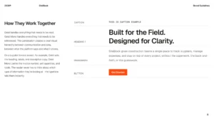
A documented scale, the specific sizes used for each level of the type hierarchy, from display headings to body copy to captions. Express in both rem (for accessibility and scalability) and px (for reference in design tools).
| Level | Size (rem) | Weight | Line height | Usage |
|---|---|---|---|---|
| Display | 3rem / 48px | 700 | 1.15 | Hero headings, major section titles |
| H1 | 2.25rem / 36px | 700 | 1.2 | Page titles |
| H2 | 1.875rem / 30px | 600 | 1.3 | Section headings |
| H3 | 1.5rem / 24px | 600 | 1.35 | Sub-section headings |
| Body Large | 1.125rem / 18px | 400 | 1.6 | Primary body copy |
| Body | 1rem / 16px | 400 | 1.6 | Standard body copy, UI text |
| Small | 0.875rem / 14px | 400 | 1.5 | Captions, labels, help text |
| XSmall | 0.75rem / 12px | 500 | 1.4 | Tags, badges, legal text |
Usage Rules
Which typeface handles which content type. Marketing headings, product UI labels, data values, and legal copy may each have different typographic treatments — document these explicitly rather than leaving them to individual interpretation.
Layer 5: Voice and Tone
This is the most underinvested section of most SaaS brand guidelines and the one that affects user experience most directly. For a SaaS product, the brand voice appears most prominently inside the product: in button labels, error messages, empty states, tooltips, and onboarding copy – not in the marketing headlines.
Brand Voice
Voice is consistent, it does not change based on context. Document the two or three qualities that define how the brand communicates across every touchpoint, with examples of each quality in practice.
Example:
Specific, not vague. We tell people exactly what will happen, not a vague approximation. “Save changes” not “Submit.” “Your session expired, log in to continue” not “An error occurred.”
Competent, not condescending. We respect our users’ expertise. We explain when explanation is useful; we do not over-explain what they already know.
Human, not corporate. We write the way a knowledgeable colleague would speak – clear and direct, without jargon or formality that creates distance.
Tone Variations
Tone adapts to context while voice stays consistent. Document how tone shifts across the most common communication contexts:
| Context | Tone | Example |
|---|---|---|
| Onboarding | Encouraging, guiding | “You’re set up – here’s your first task.” |
| Normal product use | Neutral, efficient | “3 of 7 complete.” |
| Success states | Brief, affirming | “Invoice sent.” |
| Error states | Matter-of-fact, specific | “Payment failed – the card ending 4242 was declined. Try a different card.” |
| Destructive actions | Calm, informative | “This will permanently delete the record. This cannot be undone.” |
| Marketing | Confident, benefit-led | “Track every compliance deadline. Never miss a renewal.” |
Copy Conventions
Document the specific copy rules that keep language consistent across teams and contributors:
- Capitalisation: sentence case for UI elements (not Title Case), title case for marketing headings
- Numbers: spell out one through nine in prose, use numerals for 10 and above, always use numerals for data, measurements, and UI elements
- Dates and times: 15 March 2026 (not March 15th, 2026), 14:30 (not 2:30pm) – or the reverse, documented consistently
- Oxford comma: use it (or don’t – but document which)
- Product name: always “[Product]” never just the product category noun
- Avoided words: jargon, superlatives (“revolutionary,” “best-in-class”), and passive constructions where active is possible
Layer 6: Imagery and Illustration
Photography Style
If the product uses photography, on the marketing site, in social content, in case studies, document the visual style precisely enough that any photographer or art director can produce on-brand imagery.
Direction: Real working environments over staged setups. People solving actual problems over posed product demos. Authentic expressions over stock-photo smiles.
What to avoid: The generic “team pointing at a screen” stock photo. Extreme demographic homogeneity. Fantasy dashboard screenshots that do not reflect the real product.
Technical: Document resolution requirements, aspect ratios for common use cases (social headers, blog headers, email), and any colour treatment (desaturation, brand colour overlay, consistent filter).
Illustration System
If the product uses illustration, for empty states, marketing imagery, onboarding, error states — document the illustration system with enough specificity that a new illustrator can produce on-brand work without briefing every element from scratch.
Style parameters: Line weight, corner radius treatment, colour palette (subset of brand palette), shading approach, character style if the system includes people.
When to use illustration vs photography vs UI screenshot: Each serves a different purpose. Document which contexts call for which.
Product Screenshots
For SaaS, product screenshots are one of the most used brand assets – in marketing materials, in case studies, in sales decks, in documentation. Most brand guides do not document how screenshots should be treated.
Document: how to crop (show the relevant section, not the full browser window), how to clean (simplified or anonymised data, on-brand empty states), browser chrome treatment (include or exclude, which browser, light or dark), corner radius and shadow if screenshots are displayed as assets.
Layer 7: Product UI Alignment
This is the section that distinguishes SaaS brand guidelines from brand guidelines for any other type of business — and the section most guidelines omit entirely.
A user who first encounters the marketing site and then logs into the product should experience a coherent visual progression. The product UI does not need to look identical to the marketing site, product UI has specific requirements around density, information hierarchy, and interaction patterns that marketing design does not. But the visual language should be legibly continuous.
Design Token Alignment
Document how the brand colour and typography tokens map to the product design system. The brand guideline specifies the token values; the design system specifies how those tokens are applied to components. These two systems should reference each other, not operate independently.
Marketing vs Product Visual Language
Note explicitly where the marketing visual language and the product UI visual language are intentionally different — and where they should remain consistent.
Where consistency is required:
- Primary brand colour used in the same semantic role (primary action)
- Typography: same typeface family, same scale logic
- Logo and brand mark treatment in the product header
Where intentional difference is acceptable:
- Marketing uses more decorative illustration; the product uses functional iconography
- Marketing uses larger type sizes and more whitespace; the product uses tighter density for data efficiency
- Marketing uses brand colour more liberally for visual interest; the product uses it selectively for interactive elements
Component Library Reference
A pointer to the design system, the Figma component library, the Storybook documentation, or equivalent, with a clear note that the component library is the authoritative reference for how brand elements are applied in the product UI.
What to Skip
- 60-page PDF nobody opens. Brand guidelines that are comprehensive but inaccessible produce the same result as guidelines that do not exist. A living Figma document, a shared Notion page, and a component library are more effective than a downloadable PDF that is never updated.
- Print specifications for a digital-only brand. Pantone and CMYK values are not relevant for a SaaS product that never produces print materials. Include them if you produce print; skip them if you do not.
- Brand archetypes without application. “We are the Sage archetype” is not actionable without the specific copy and design decisions it implies. Either derive the actionable guidelines from the archetype framework or skip the framework entirely.
- Every logo don’t imaginable. Three to five clear incorrect usage examples are sufficient. Fifteen examples of ways not to use the logo adds length without value — if the do’s are clear, most of the don’ts become obvious.
- Mission and values as brand guidelines. Mission statements and company values belong in company documentation. They inform brand guidelines but are not brand guidelines themselves. Do not pad the guidelines with content that belongs elsewhere.
How Inity Builds Brand Guidelines
At Inity, brand guidelines for SaaS products are built alongside the design system, not as a separate document that the design system tries to align with, but as the strategic layer that the design system is built on. The colour tokens in the brand guidelines become the Figma variables and CSS custom properties in the product. The typography scale in the guidelines becomes the type tokens in the component library. The voice and tone guidelines feed directly into the UX copy review process.
The output is not a PDF. It is a set of living references, a Figma brand library, a component library, and a shared Notion doc for voice and tone that are updated when the brand evolves and referenced daily by the team that uses them.
Conclusion
SaaS brand guidelines that work are not the most comprehensive ones. They are the ones that govern the right things, the surfaces where the brand actually lives and where inconsistency causes the most damage. For a SaaS product, that means covering the product UI layer, the voice and tone of copy inside the product, and the token system that connects brand decisions to the codebase, not just logo clearspace and Pantone references. Build them as living documents. Keep them where your team already works. Update them when the product evolves. The brand guideline that is three pages long and used every day is worth more than the 60-page document nobody opens.
→ Building a SaaS product and want brand identity and design system built together from day one? Book a Discovery Week call.
Frequently Asked Questions
SaaS brand guidelines should include seven layers: brand strategy foundation (positioning, audience, personality), logo system (primary, variations, dark mode, incorrect usage), colour system with semantic roles and design tokens, typography system with a complete type scale, voice and tone with product copy examples, imagery and illustration rules, and product UI alignment, documenting how the brand connects to the design system and component library. The most commonly missing sections are voice and tone for product copy and product UI alignment.

Ready to Build Your SaaS Product?
Free 30-minute strategy session to validate your idea, estimate timeline, and discuss budget
What to expect:
- 30-minute video call with our founder
- We'll discuss your idea, timeline, and budget
- You'll get a custom project roadmap (free)
- No obligation to work with us