How to Use Design to Reduce SaaS Churn in the First 90 Days?
More than 50% of SaaS churn happens within the first 90 days, and most of it is not a pricing problem, a support problem, or a product-market fit problem. It is a design problem. Users leave because they cannot find the value fast enough. They get confused, hit friction, lose momentum, and quietly stop coming back. At Inity Agency, we have redesigned onboarding flows for SaaS products across HealthTech, PropTech, and FinTech, and the pattern is consistent: the products with the highest early churn are not broken, they are just unclear. Design is the fastest lever for fixing that.
Why the First 90 Days Are the Highest Churn Risk
The first 90 days represent the highest churn risk because customers are learning the product, implementing processes, and determining whether the solution meets their needs. This is not a window where users are giving the product a fair evaluation. It is a window where they are actively deciding whether to invest further time, and every friction point accelerates that decision toward exit.
The numbers are stark. Over 50% of churn happens within the first 90 days. Users who don’t engage within the first 3 days have a 90% chance of churning. And onboarding dropoff rates typically range from 30–50% for SaaS and product-led growth companies, meaning roughly one in three to one in two users who sign up never reach their first meaningful interaction with the product.
The cost is compounding. With average SaaS customer acquisition costs reaching $650–$1,100, losing 75% of users within the first week is a $1M+ annual revenue leak for most growing subscription companies.
Critically, most churn strategies focus on price, promos, or heroic customer success. But the quiet killer is preventable friction: confusing onboarding, vague CTAs, and workflows that make people put in too much effort. These are design problems. And design problems have design solutions.
The Aha Moment: The Most Important Design Target in Onboarding
The “aha moment” is the specific point at which a new user first experiences the core value of your product, the moment the product clicks. Everything in your onboarding flow should be engineered to get every user to this moment as quickly as possible.
The aha moment is not about discovering a feature. It is about achieving a tangible outcome. For Slack, it is sending the first message and getting a reply. For a project management tool, it is seeing a task move across a board. For a FinTech SaaS, it might be generating the first report that replaces a manual spreadsheet.
Companies that identify and optimize for their aha moment see 2–3× improvements in activation rates within 90 days. The design implication is direct: map the shortest possible path from signup to that moment, and remove every step that is not on that path.
How to find your aha moment: Use cohort analysis to compare users who retained at 30 days versus those who churned. Look for the specific feature interaction or action where retention probability jumps significantly, typically by 20 or more percentage points. That interaction is your aha moment. Once identified, every onboarding design decision should serve one goal: getting users there faster.
Design Lever 1 – Shorten Time-to-Value
Time-to-value (TTV) is the time between a user signing up and experiencing their first meaningful outcome from the product. It is the single most predictive onboarding metric for early retention.
Cutting TTV by 20% lifted ARR growth by 18% for mid-market SaaS in a 2024 Amplitude study. B2B customers want ROI demonstrated in the first 14 days, and 83% of B2B buyers say slow onboarding is a dealbreaker.
Design decisions that shorten TTV:
- Remove the account setup tax. Every field, permission request, and configuration step before the user reaches core functionality is TTV overhead. Audit your signup and initial setup flow and cut everything that is not essential for first use. Profile completion, billing setup, and integrations can wait.
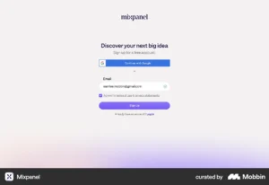
- Default to a working state. Where possible, pre-populate the product with demo data, templates, or a sample project so users experience the product in action immediately, rather than facing a blank canvas. Canva and Miro do this exceptionally well, users land in a template, not an empty screen.
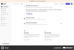
- Use outcome-driven CTAs. The difference between “Next” and “Create your first report” is the difference between a generic step and a moment of momentum. Every CTA in the onboarding flow should describe a concrete outcome, not a navigation action.
- Build a quick win into the first session. Products with a “quick win” in onboarding retain 80% more users. Design a deliberate early success moment – something achievable in under five minutes that demonstrates real value, and make it the target of the first-session flow.
Design Lever 2 – Remove Friction from the Critical Path
Friction in onboarding is anything that requires users to put in effort that does not directly advance them toward the aha moment. It compounds. Each friction point individually may seem minor; collectively they create the conditions for abandonment.
72% of users abandon apps during onboarding if it requires too many steps. The friction most founders underestimate is not broken functionality, it is cognitive friction: unclear language, ambiguous navigation, too many choices presented simultaneously.
The most common onboarding friction points:
| Friction Type | What it looks like | Design fix |
|---|---|---|
| Too many steps | 8-step setup wizard before reaching the core product | Cut to 3 steps max; defer the rest |
| Blank canvas problem | Empty dashboard with no guidance on where to start | Pre-populate with sample data or templates |
| Internal jargon | Product uses terminology users don’t recognise | Replace with user’s language from discovery/sales |
| Feature dumping | All features surfaced at once in the first session | Progressive disclosure – reveal by context |
| Unclear next action | User completes a step and doesn’t know what to do next | Single, explicit, outcome-driven CTA per screen |
| Premature depth | Asks for billing, team setup, integrations before core value | Defer everything non-essential to post-activation |
Misaligned terminology breaks trust. When your product “speaks” like your users, they understand and act faster. This is a copywriting and information architecture problem at its root — but it is a design decision. Every label, tooltip, and error message is a moment of either reducing or adding friction.
Design Lever 3 – Personalise the Onboarding Path
Generic onboarding treats all users the same. A FinTech founder and an operations manager at an enterprise sign up for the same product with entirely different mental models of what success looks like. If both see the same first-session flow, one of them will churn.
Personalised onboarding increases retention by 40% versus generic flows. Tailored onboarding paths increase Day 30 retention by 52%.
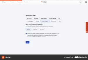
The simplest implementation: Ask 2–3 qualifying questions immediately after signup: role, primary goal, company size. Use the answers to route users to a flow that surfaces features relevant to their use case first. You do not need complex branching logic at MVP stage; even two distinct paths (individual vs. team) will materially improve activation.
Behavioural triggers over time-based triggers: Rather than sending the same email on day 3 to all users, trigger guidance based on what users have and have not done. User completes first core action → introduce next relevant feature. User logs in three days in a row → surface a power feature. User goes 72 hours without logging in → re-engagement prompt with a specific, concrete suggestion.
Design Lever 4 – Use Progressive Disclosure
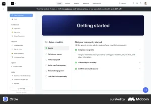
Progressive disclosure is a design pattern where functionality and complexity are revealed gradually, as users become ready for it. It is the antidote to feature dumping — the tendency to show users everything the product can do the moment they arrive.
Companies that show users all their features during onboarding lose users faster because the cognitive load of evaluating everything at once exceeds the value of any individual feature. Progressive disclosure solves this by establishing a clear hierarchy: show the minimum required to reach the aha moment first, then reveal depth as users demonstrate readiness.
In practice:
- Day 1 flow surfaces only the features needed to reach the aha moment
- In-app tooltips and contextual hints appear when users hover over or navigate to relevant areas, not as a walkthrough on arrival
- Advanced settings, integrations, and power features are accessible but not foregrounded until users have completed basic activation
- Onboarding checklists surface as a secondary layer, not a blocker to using the product
Users who complete an onboarding checklist are 3× more likely to become paying customers. The key design insight: the checklist works not because it forces users to complete tasks, but because it gives users a clear, visible picture of what progress looks like, and progress is motivating.
The 90-Day Retention Design Framework
Reducing churn in the first 90 days is not a single intervention, it is a designed sequence across three distinct phases.
Days 1-7: Activation Goal: Get every user to the aha moment within the first session, or at most the first week. Design focus: Signup flow, first-session experience, quick win, initial email sequence. Key metric: Activation rate, the percentage of signups who reach the defined aha moment.
Days 8-30: Habit Formation Goal: Move users from “tried it once” to “uses it regularly.” Design focus: Feature discovery, contextual prompts, in-app guidance, behavioural email triggers. Key metric: Day-30 retention rate; feature depth (number of distinct features used per activated account).
Days 31-90: Expansion Goal: Deepen usage, demonstrate ongoing value, trigger upgrade or expansion intent. Design focus: Advanced feature introduction, team/collaboration features, reporting and value summaries, renewal-relevant touchpoints. Key metric: Day-90 retention rate; NRR (net revenue retention).
What Good Onboarding Design Is Not
A few misconceptions worth naming directly:
It is not a product tour. A modal-based walkthrough that forces users through a scripted tour of every feature on arrival is not onboarding. It is a tutorial that most users click through or dismiss without retaining anything. Good onboarding is contextual, triggered by what users do, not what you want to show them.
It is not a checklist of every feature. An onboarding checklist with 15 items is not helpful, it is overwhelming. A checklist of 4–5 items focused on reaching core value is motivating.
It is not a one-time design decision. Onboarding is an ongoing design practice. Every new feature, every change to the signup flow, and every update to pricing can introduce new friction. Retention metrics should be reviewed every sprint, not every quarter.
It is not separate from the product. Treating onboarding as a layer added on top of the product, tooltips over a confusing interface, patches symptoms. The most effective onboarding redesigns fix the underlying product navigation and information architecture, not just the guidance layer on top of it.
Conclusion
Early SaaS churn is a design problem before it is anything else. Users who cannot reach your product’s core value quickly enough do not churn because they dislike the product, they churn because they never understood it. Shortening time-to-value, removing onboarding friction, personalising user paths, and applying progressive disclosure are not onboarding tactics. They are retention investments with measurable financial returns. A 5% improvement in retention can drive a 25–95% increase in profits over time. The first 90 days are where that work begins, and where most products leave the most revenue on the table.
→ Inity Agency designs SaaS onboarding flows and product experiences built for retention from day one. If your trial-to-paid conversion is lower than it should be, the answer is usually in the first session.
Frequently Asked Questions
The first 90 days are when users decide whether your product is worth the ongoing investment of time and money. If they do not experience clear value quickly — through a well-designed onboarding flow that leads them to their "aha moment", they disengage. Most early churn is not caused by the product failing to deliver value. It is caused by users failing to discover that value because of friction, unclear navigation, or a time-to-value that is too long.

Ready to Build Your SaaS Product?
Free 30-minute strategy session to validate your idea, estimate timeline, and discuss budget
What to expect:
- 30-minute video call with our founder
- We'll discuss your idea, timeline, and budget
- You'll get a custom project roadmap (free)
- No obligation to work with us