Empty States in UX Design: The Hidden ROI Most SaaS Products Miss

Empty states are the most undervalued touchpoint in SaaS product design. When a screen has no data, no history, or no content to display, most teams treat it as a placeholder – a blank space to fill later. At Inity Agency, we’ve seen the opposite: strategically designed empty states reduce user drop-off by up to 35%, increase feature adoption by 27%, and cut support tickets by 42%. The moment of emptiness is one of your highest-ROI design decisions.
What Are Empty States in UX Design?
In UX Design empty states are screens or UI components that appear when there is no data, content, or history to display – such as a new user’s dashboard before setup, an empty inbox, or a search with no results. Every SaaS product has them, but few design them intentionally.
Empty states appear in three distinct situations: first-use (a new user hasn’t created any content yet), user-cleared (a user has deleted or completed everything), and no-results (a search or filter returns nothing). Each scenario requires a different design response. Treating all three the same way – or worse, ignoring all three – creates unnecessary friction at moments when users are most likely to disengage.
Why Do Empty States Matter for SaaS Business Metrics?
They (empty states) directly impact activation rates, retention, and support volume – three metrics that compound into LTV. A blank screen with no guidance is one of the leading causes of first-session drop-off, because new users interpret emptiness as confusion rather than a starting point.
The business case is concrete. Based on Inity Agency’s work across SaaS products, well-designed empty states deliver measurable outcomes:
| Metric | Impact |
|---|---|
| User drop-off rate | Reduced by up to 35% |
| Feature adoption | Increased by 27% |
| “How-to” support tickets | Reduced by 42% |
| User satisfaction scores | Improved by 31% |
These aren’t vanity metrics. Drop-off reduction directly extends customer lifespan. Feature adoption increases ARPU. Support ticket reduction lowers cost per user. Every empty state you improve is a compounding revenue decision, not just a design detail.
What Are the Key Elements of a High-Converting Empty State?
A high-converting empty state includes 4 elements: a clear explanation of why the screen is empty, an actionable next step with a prominent CTA, brand-consistent tone and visuals, and an educational hook that helps users understand what the feature does. Missing any one of these elements significantly reduces conversion from empty to active state.
1. Clear Communication
Users should never have to guess why something is empty. The copy should explain the state in plain language – “You haven’t created any projects yet” is better than a blank screen or a generic “Nothing here.” Provide context about what belongs in this space and what value it will deliver once populated.
2. Actionable Next Steps
Every empty state needs a primary CTA that makes the next action obvious. Where appropriate, offer secondary paths – a tutorial, a template, or a sample dataset – so users with different confidence levels all have a way forward. Remove every obstacle between the user and their first meaningful action.
3. Brand Personality
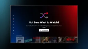
Empty states are brand touchpoints, not error messages. Use your product’s voice, tone, and visual language consistently. A well-placed illustration or a moment of wit transforms potential frustration into delight. Think about how Slack’s empty state uses humor, or how Notion uses templates to make a blank page feel like an opportunity.
4. Educational Opportunity
First-use empty states are the single best moment to teach users what a feature does – because they’re paying attention. Use this moment to showcase what the populated state looks like, offer a quick-start tip, or set accurate expectations about what they’re about to build.
How Should You Implement Empty States Strategically?
Empty states should be designed during initial wireframing, not added as an afterthought after core flows are built. The implementation process follows three phases: design early, measure impact, and iterate based on data. Teams that treat empty states as core functionality – not edge cases – consistently see better activation and retention outcomes.
Phase 1: Design Early
- Include empty state screens in every wireframe alongside the populated state
- Define the three empty state types (first-use, user-cleared, no-results) for each feature
- Write CTA copy and educational content before visual design begins
- Test empty state messaging with real users before development
Phase 2: Measure Impact
- Track click-through rate on empty state CTAs
- Monitor time-to-first-action after empty state exposure
- Measure conversion rate from empty to populated state per feature
- Segment by user cohort – new vs. returning, free vs. paid
Phase 3: Iterate Based on Data
- A/B test CTA copy and placement
- Refine messaging based on support ticket patterns – recurring questions signal unclear empty states
- Update empty states when features change – stale copy creates confusion
- Review empty state performance in quarterly UX audits
What Mistakes Do Teams Make When Designing Empty States?
The most common empty state design mistakes are treating them as error messages, using technical jargon, omitting CTAs, and assuming users understand why content is missing. Each mistake turns a recoverable moment of confusion into a drop-off event – and most teams never connect the churn to the design decision that caused it.
Common Pitfalls
| Mistake | Why It Hurts | Fix |
|---|---|---|
| Blank screen with no copy | Users assume the product is broken | Always explain the empty state |
| Technical error language | Creates anxiety, not confidence | Use friendly, plain-language copy |
| No CTA | Users have no path forward | Always include a primary next step |
| Generic “No data” messages | Provides no context or education | Write state-specific copy for each feature |
| Same design for all empty types | Mismatches user context | Differentiate first-use, cleared, and no-results states |
Real-World Example: Empty States in a SaaS Dashboard
A SaaS client approached Inity Agency with a retention problem: new users were activating their accounts but abandoning the product within the first 48 hours. Analytics showed the primary drop-off point was the main dashboard – which appeared completely blank on first login.
The redesign added three empty state components:
- Dashboard empty state – illustrated with a sample populated view, a single “Create your first project” CTA, and a one-line explanation of what the dashboard tracks
- Activity feed empty state – copy reading “Your activity will appear here once you start working. Try creating a project to get started” with a secondary link to a 2-minute tutorial
- No-results search state – specific messaging with suggested search terms and a link to browse all content
Results after 60 days: 27% increase in feature adoption, 42% reduction in how-to support tickets, and 31% improvement in satisfaction scores. The product didn’t change. The empty moments did.
Conclusion
Empty states are not a design afterthought – they are high-ROI touchpoints that directly affect activation, retention, and support costs. Every blank screen a user encounters without guidance is a potential drop-off event. Designing empty states early, measuring their impact, and iterating based on data turns moments of potential frustration into moments of product education and user confidence. The SaaS products that treat empty states as core UX – not edge cases – consistently outperform those that don’t. If you want a UX audit that identifies these hidden friction points across your product, book a free strategy call with Inity Agency.
Frequently Asked Questions
An empty state in UX design is any screen or UI component that appears when there is no data, content, or history to display. Common examples include a new user's blank dashboard, an empty inbox, or a search with no results. Empty states occur in three contexts: first-use, user-cleared, and no-results – each requiring a distinct design response.

Ready to Build Your SaaS Product?
Free 30-minute strategy session to validate your idea, estimate timeline, and discuss budget
What to expect:
- 30-minute video call with our founder
- We'll discuss your idea, timeline, and budget
- You'll get a custom project roadmap (free)
- No obligation to work with us